

irobot: roomba packaging
Overview
Over the course of a 3 month contract, I created packaging designs for iRobot’s newest robot vacuum, the Roomba Combo® Essential. The box was designed to be universal worldwide, which meant that we needed to account for information to be translated into 13 different languages. Additionally, this robot was the first in its series, so the design decisions I made here informed the packaging for other Roombas down the line.
I mainly focused on the exterior packaging, but also played a role in the interior graphics and conception of the unboxing user experience.
Tools & Skills
Adobe Illustrator
Branding
Sketching
Role
Packaging
& Graphic Designer
Exterior: Box
When I joined the team, some key elements about the packaging had already been decided: the dimensions were locked down, we were definitely going to use a sticker on the side of the box to show the product in detail, and the number of ink colors I could use were very limited. We wanted the box to contain less ink, plastic, and foam so that it would be less costly to produce and more sustainable overall.
Knowing all of this, I started sketching out some ideas for how the front of the box could look. We ended up really liking the designs that showcased the Roomba’s iconic squiggly path.
Initial sketches for exterior packaging concepts
I then brought my designs into Illustrator and further refined my concepts. We initially liked the large robot illustration, but then decided that the path idea was more compelling. However, as I kept iterating, we thought that the illustrated robot was competing with the robot photo on the sticker. This led us to move the robot to the side of the box and change the layout of the path from diagonal to horizontal.
A few exterior design iterations
Although I was initially apprehensive about moving away from the diagonal path idea, I quickly realized that by making the robot smaller and moving it to the side of the box, we could better capture the movement of the robot.
Final front and side panels
Exterior: Sticker
The sticker on the exterior was a vital element in communicating what was inside the box. It was the only part of the exterior with full color, had to communicate the vacuum’s basic functions with mainly photos (any words had to be translated in 2 to 6+ languages, depending on the region), and had to signify the product’s tier within its series.
To communicate that the robot can vacuum and mop, I added arrows and a water droplet icon to the underside image.
Final sticker design
Interior
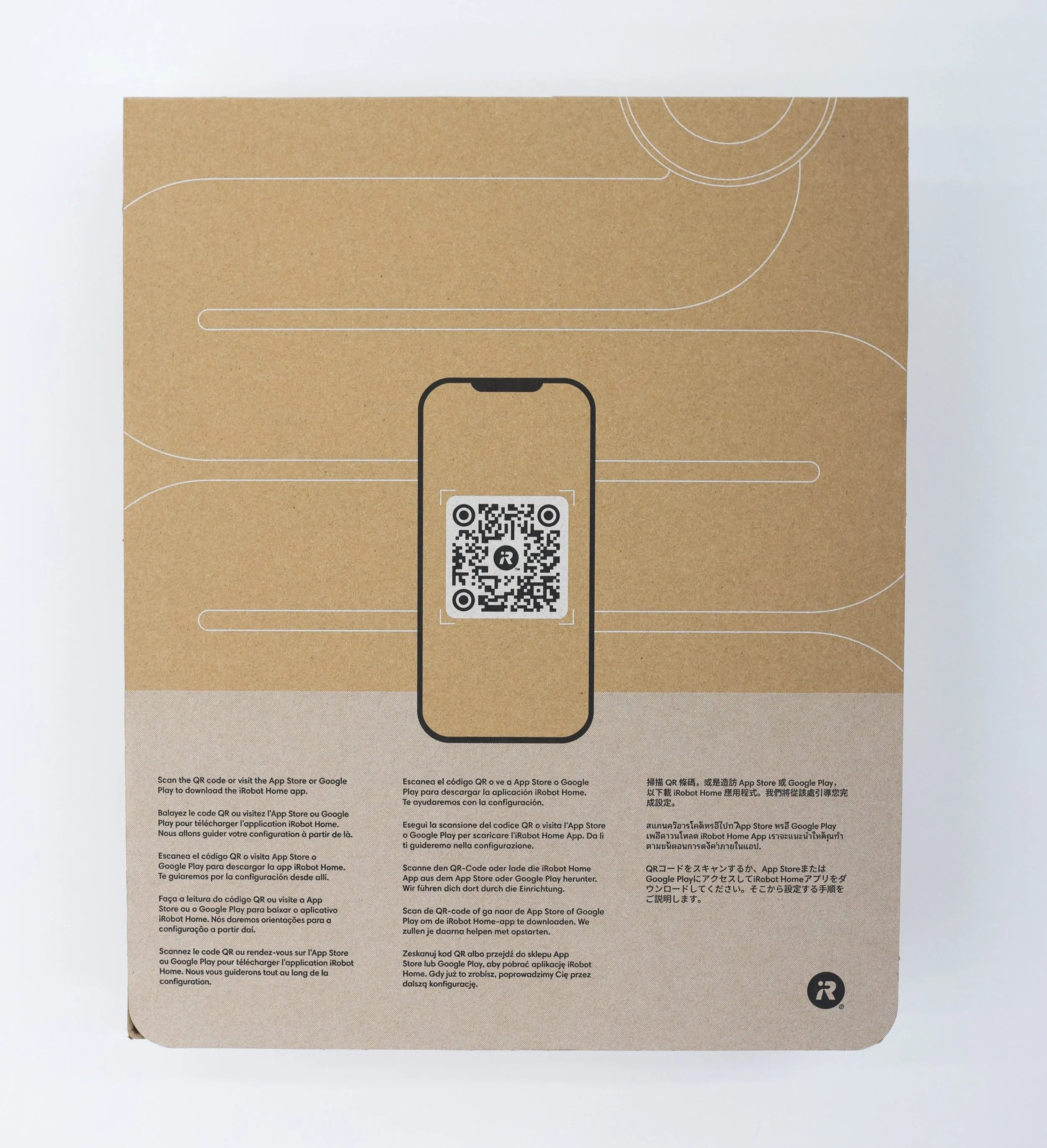
When the customer opens the box, they need quick instructions on how to remove the vacuum to ensure that they don’t immediately drop and damage it. Our solve here was to create flap that folded over the product and created a natural handle for the user. This handle encourages the user to slide it out with the intended side facing up.
This flap was also a great spot to greet the user and encourage them to scan a QR code to begin setting up their device.
Initial sketches for interior flap
We finally landed on a design that was very straightforward and relied more on imagery than text. The text we did include was translated into 13 different languages, since this flap was placed inside every box worldwide.
Final interior flap
Conclusion
This was my first “real” packaging design project and I learned so, so much along the way. Although there were many limitations and aspects of the design that were decided for me, I really enjoyed playing around with different concepts and iterating on our final “squiggly path” design. I also love that this project aimed to reduce the amount of plastic used in iRobot’s packaging—sustainability is something that I care about and would love to design more for in the future. This was such a fulfilling, rewarding project and I hope to work on more packaging designs in the future!


